New feature: Charting improvements
We have some exciting Sharesight enhancements in the works regarding portfolio analytics (includes benchmarking!). Now, in order to lay some of the groundwork we've made some big improvements to the charting feature on the Portfolio Overview page, which are now available.
First, your holdings are now split out by the market they belong to. Each colour corresponds to the ASX, NZX, NYSE, LSE, and so forth. If you move your mouse across the chat, you'll see crosshairs, which display a date, a total portfolio value, and the commensurate values for each market.

Just below the chart, you'll also notice a colour key. If you click on a market, it will be hidden from your chart dynamically. This is a handy way to isolate holdings from a particular market.

We've also introduced a line charting option. Again, this is in preparation for a few more features down the track (line charts being more flexible than area charts for plotting disparate investment types).

And don't forget about the growth chart either. This one is our favourite as it shows the contribution (or detraction) of capital gains/losses, dividends, and currency. Expect lots more in the way of portfolio decomposition in the future!

FURTHER READING


Save time and money by sharing your portfolio with your accountant
It's easy to save time and money at tax time by sharing access to your Sharesight portfolio with your accountant. Keep reading to learn more.


Morningstar analyses Australian investors' top trades of FY26
Morningstar analyses Australian Sharesight users' top trades of FY25/26. Keep reading to see some of the most notable picks from the year.

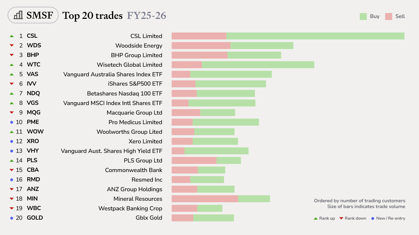
Top SMSF trades by Australian Sharesight users in FY25/26
Welcome to our annual Australian financial year trading snapshot for SMSFs, where we dive into this year’s top trades by Sharesight users.